T>T: Simple GUI Graph Plotter in Python
Plotting data is a key part of any science and there are a lot of software solutions designed for this purpose, e.g. Excel, Veusz, gnuplot etc… These are all fine but something which I often need is a means to quickly plot multiple data files for comparison and have the plot look half-decent for a presentation. The problem with a lot of plotting software is they have so many options and controls that it can sometimes be time consuming to produce the type of plot you are after, especially with lots of data files.
In this post we will build a useful program allowing for very quick plotting of data files using Python and write a very simple Graphical User Interface (GUI) to interact with it which will look like:

I use this program regularly in my work and I hope it can prove useful for you. Skip to the end for the complete program with GUI or read on to see how it is implemented.
Plotting Code Without GUI
The important quality of this program is that we want it to be generalised for as many data files as needed with a few options for plot aesthetics. First we will program it to take the data files from the command line and ask for the user to provide the relevant options to construct the plot. Later we will streamline this using a GUI. The terminal syntax to run the program which I call Plot is as follows.
1
$ Plot Data_file1.txt Data_file2.txt Data_file3.txt ...
We will use pandas to store the user data and matplotlib with Seaborn styling to produce the plot. First we import the relevant modules as follows.
1
2
3
4
5
6
import matplotlib.pyplot as plt # Import matplotlib
import seaborn as sns           # Import seaborn
import pandas as pd             # Import pandas
import sys                      # This will be used later
import itertools                # This will be used later
sns.set_style("darkgrid")       # Set the seaborn dark grid styling
The first thing we want our program to do is print a small message explaining what it does. e.g. as follows:
1
2
3
4
# Print a message to summarise the purpose of the script.
print("\nThis is Plot. Its intended purpose is to quickly plot data files for visualisation\n----------------------------------------------------------------------------------")
print("\nN.B. You can use LaTeX math code for axis labels, e.g. $\mathbf{r}$\n")
print("N.B. To use regular text in math mode use $\mathrm{Text}$\n")
Another feature we will program is to allow use of LaTeX math fonts and syntax for the axis labels and legend entries. Now the user knows what the program does, we can begin to ask them about their plot(s). The first piece of information being the \(x\) and \(y\) axis labels. Using the input function will prompt the user to enter input on the command line.
1
2
3
# Get the user to specify the x and y axis labels for the plots
xAxisLabel = input("Enter x-axis label: ")
yAxisLabel = input("Enter y-axis label: ")
Files provided may have multiple columns of data so another option we need is to specify the index of the columns that need plotting. Python is 0-indexed meaning the first item has index 0 but we will use index 1 as the first column which is more intuitive for the user. This is easy to implement as we just need to subtract 1 from the provided index so Python can understand it. As the user can provide more than one data file, we need to place our code inside a loop over the number of data files. We will also ask for the legend label desired for each data file along with the type of plot (point|line plot).
1
2
3
4
5
6
7
8
9
10
11
12
13
14
15
16
17
18
19
20
21
22
23
24
print("\nEnter the indices of the columns you want to plot. e.g. 1 for column 1, 2 for column 2 etc...\n")

ListOfDataSets = [] # Create empty list which will hold the list of data files provided
LegendLabels   = [] # Create empty list which will hold the legend labels provided
xcols          = [] # Create empty list which will hold the indices of the x columns for each file
ycols          = [] # Create empty list which will hold the indices of the y columns for each file
cols_to_use    = [] # Create empty list which will hold the combined (x,y) index or the plot
plot_type      = [] # Create empty list which will hold the type of plot (point|line)
# Start loop over the number of files provided in sys.argv i.e. the command line arguments
for arg in sys.argv[1:]:
    # Append the data files from the command-line to a single list
    ListOfDataSets.append(arg)
    # Append the column indices to a list for later
    xcolindex = (int(input("\nEnter x column index for data set '{}': ".format(arg))) - 1) # Subtract 1 from provided index
    ycolindex = (int(input("Enter y column index for data set '{}': ".format(arg))) - 1) # Subtract 1 from provided index
    # Append the separate x and y column indices to their respective lists. These are used when plotting using Seaborn below
    xcols.append(xcolindex)
    ycols.append(ycolindex)
    # Append both the x and y to a combined list in order to construct the DataFrame object
    cols_to_use.append([xcolindex, ycolindex])
    # Append the user specified legend labels to a list for later
    LegendLabels.append(input("Enter Legend label for data set {}: ".format(arg)))
    # Ask whether or not a point plot or line plot is needed and append to plot_type
    plot_type.append(input("Do you want this plotted as a scatter plot or a line plot? [point | line]: "))
The user input part of the program is now complete and we have access to all the user data provided. We can now automate the plotting of the data files. Usually it is customary to program in error messages if certain inputs are not provided, but here we will not as the user may not want to provide legend, or \(x\) and \(y\) labels and just quickly plot two data sets to compare trends (by user, I mean me being lazy of course…). The next part of the program is very simple:
- We iterate over the data files and place the required columns into a pandas
DataFrameusingread_csv. It has been programmed to understand multiple column seperators usingsep="\s+|\t+|\s+\t+|\t+\s+|,\s+|\s+,"as different files may have different column styles. You can add your unique ones to the list by adding more, for example a colon seperator,|:. - We then provide the plotting commands depending on if the user wants a
lineorscatterplot. If no option for plot type was provided then it will default toline. - It then looks for the minimum and maximum of the \(x\) and \(y\) columns to correctly set the range and converts the user input for the axis labels and legends into LaTeX format using the convenient
r{}notation inmatplotlib.
1
2
3
4
5
6
7
8
9
10
11
12
13
14
15
16
17
18
19
20
21
22
23
24
25
26
27
28
29
30
31
32
33
34
35
36
37
fig, ax = plt.subplots(figsize=(4, 4))
# Provide some nice colours to iterate through. The standard colour palette of matplotlib is naff.
colors = itertools.cycle(["dodgerblue", "indianred", "gold", "steelblue", "tomato", "slategray", "plum", "seagreen", "gray"])

for i in range(0, len(ListOfDataSets)):
    # Read in data set into a pandas dataframe. Note [cols_to_use[i]] at the end maintains column index order
    # The sep command tries to capture all the main column separators that it may encounter. If you have a unique one, you can add it here!
    df = pd.read_csv(ListOfDataSets[i], usecols=cols_to_use[i], sep="\s+|\t+|\s+\t+|\t+\s+|,\s+|\s+,", header=None, engine='python')[cols_to_use[i]]
    # Plot the data set using Seaborn and set legend labels from user specified ones above
    if plot_type[i] == 'point':
        ax.scatter(df[xcols[i]], df[ycols[i]], color=next(colors), s=10, label=r'{}'.format(LegendLabels[i]))
    elif plot_type[i] == 'line':
        ax.plot(df[xcols[i]], df[ycols[i]], color=next(colors), label=r'{}'.format(LegendLabels[i]))
    else:
        # If a plot type is not specified [point | line] then default to line
        print("\n No option for plot type specified, defaulting to line plot")
        ax.plot(df[xcols[i]], df[ycols[i]], color=next(colors), label=r'{}'.format(LegendLabels[i]))

    # Work out the minimum and maximum values in the columns to get the plotting range correct
    xmin = df[xcols[i]].min()
    xmax = df[xcols[i]].max()
    ymin = df[ycols[i]].min()
    ymax = df[ycols[i]].max()

    # Set axis limits
    plt.xlim(xmin, None)
    plt.ylim(ymin, None)

    # Set the x and y axis labels from the user specified ones above
    plt.xlabel(r'{}'.format("xAxisLabel"))
    plt.ylabel(r'{}'.format("yAxisLabel"))

    # Show the legend
    plt.legend()

# Finally show the plot on screen
plt.show()
Plotting Code With GUI
I used to use tkinter to make GUIs but the process is laborious and scientists don’t need to waste time making super duper RAM intensive Google Chrome-esque GUIs. I have recently been using PySimpleGUI which transforms tkinter, Qt, Remi and WxPython into portable people-friendly Python interfaces. It takes a lot of the effort and time out of making a GUI for your program and is perfect for scientific applications. This can be installed using:
1
2
3
pip install pysimplegui
or
pip3 install pysimplegui
The GUI portion of the code is now presented in two parts. The first is code for a window for selecting your data files and the second is code to produce a window for customising the plots. Comments are provided for all the important aspects of the code. I advise looking through the PysimpleGUI Cookbook which offers a lot of worked examples and shows how simple it can be to create a GUI for your Python program.
To build a window that allows for browsing of files, the following can be done:
1
2
3
4
5
6
7
8
9
10
11
12
13
14
15
16
17
18
19
20
21
22
23
24
25
26
27
28
29
import matplotlib.pyplot as plt
import seaborn as sns
import pandas as pd
import PySimpleGUI as sg
import sys
import os
import itertools
# Set the seaborn dark grid styling
sns.set_style("darkgrid")
# Set the theme for PysimpleGUI
sg.theme('DarkAmber')
# Create the window for the user to browse and select their data files
# The file names are stored as a semi-colon separated list.
#
if len(sys.argv) == 1:
    event, fnames = sg.Window('Select File(s) you wish to plot.').Layout([[sg.Text('Note, select multiple files by holding ctrl and clicking the number required.')],
                                                                          [sg.Input(key='_FILES_'), sg.FilesBrowse()],
                                                                          [sg.OK(), sg.Cancel()]]).Read(close=True) # Add Ok and Cancel buttons
    # Close the window if cancel is pressed
    if event in (sg.WIN_CLOSED, 'Cancel'):
        exit()
else:
    # Check to see if any files were provided on the command line
    fnames = sys.argv[1]

# If no file names are selected, exit the program as these are required
if not fnames['_FILES_']:
    sg.popup("Cancel", "No filename supplied")
    raise SystemExit("Cancelling: no filename supplied")
The next part builds the customisation window with drop-down menus to select options such as the type of plot, line colours, line styles and labels:
1
2
3
4
5
6
7
8
9
10
11
12
13
14
15
16
17
18
19
20
21
22
23
24
25
26
27
28
29
30
31
32
33
34
35
36
37
38
39
40
41
42
43
# Separate the file names so they can be processed individually
fnames = fnames['_FILES_'].split(';')
# Count the number of files provided
no_files = len(fnames)
# List the available colours for the plots. More can be added to this list
matplotlib_colours = ["dodgerblue", "indianred", "gold", "steelblue", "tomato", "slategray", "plum", "seagreen", "gray"]
# List the line-styles you want. More can be added to this list
matplotlib_linestyles = ["solid", "dashed", "dashdot", "dotted"]
# The text of the headings for the drop-down menus
headings = ['X,Y INDICES', '  TYPE', 'COLOUR','LINE', '  LEGEND']

# Create the layout of the Window
layout = [  [sg.Text('You can use LaTeX math code for axis labels and legend entries, e.g. $\mathbf{r}$', font=('Courier', 10))],
            [sg.Text('To use regular text in math mode use $\mathrm{Text}$\n')],
            [sg.Text('_'  * 100, size=(100, 1))], # Add horizontal spacer
            [sg.Text('X-axis label:'),
              sg.InputText('')],
            [sg.Text('Y-axis label:'),
              sg.InputText('')],
            [sg.Text('_'  * 100, size=(100, 1))], # Add horizontal spacer
            [sg.Text('                                        ')] + [sg.Text(h, size=(11,1)) for h in headings],  # build header layout
            *[[sg.Text('File: {}'.format(os.path.basename(os.path.normpath(i))), size=(40, 1)),
               sg.InputText('X', size=(5, 1)),
               sg.InputText('Y', size=(5, 1)),
               sg.InputCombo(values=('point', 'line')),
               sg.InputCombo(values=(matplotlib_colours)),
               sg.InputCombo(values=(matplotlib_linestyles)),
               sg.InputText('Enter Legend Label', size=(20, 1)),
              ] for i in fnames
             ],
            [sg.Text('_'  * 100, size=(100, 1))], # Add horizontal spacer
            [sg.Button('Plot'), sg.Button('Cancel')],
         ]

# Create the Window using the specified layout
window = sg.Window('Plot v1-01', layout)
# Read in the events and values
event, values = window.read()
# If cancel is pressed then close the window and exit
if event in (sg.WIN_CLOSED, 'Cancel'):
    exit()

window.close()
Complete GUI Plotter Code
1
2
3
4
5
6
7
8
9
10
11
12
13
14
15
16
17
18
19
20
21
22
23
24
25
26
27
28
29
30
31
32
33
34
35
36
37
38
39
40
41
42
43
44
45
46
47
48
49
50
51
52
53
54
55
56
57
58
59
60
61
62
63
64
65
66
67
68
69
70
71
72
73
74
75
76
77
78
79
80
81
82
83
84
85
86
87
88
89
90
91
92
93
94
95
96
97
98
99
100
101
102
103
104
105
106
107
108
109
110
111
112
113
114
115
116
117
118
119
120
121
122
123
124
125
126
127
128
129
130
131
132
133
134
135
136
137
138
139
140
141
142
143
144
145
146
147
148
#!/usr/bin/env python3
import matplotlib.pyplot as plt
import seaborn as sns
import pandas as pd
import PySimpleGUI as sg
import sys
import os
import itertools
# Set the seaborn dark grid styling
sns.set_style("darkgrid")
# Set the theme for PysimpleGUI
sg.theme('DarkAmber')

if len(sys.argv) == 1:
    event, fnames = sg.Window('Select File(s) you wish to plot.').Layout([[sg.Text('Note, select multiple files by holding ctrl and clicking the number required.')],
                                                                          [sg.Input(key='_FILES_'), sg.FilesBrowse()],
                                                                          [sg.OK(), sg.Cancel()]]).Read(close=True)
    # Close the window if cancel is pressed
    if event in (sg.WIN_CLOSED, 'Cancel'):
        exit()

else:
    # Check to see if any files were provided on the command line
    fnames = sys.argv[1]

# If no file names are selected, exit the program
if not fnames['_FILES_']:
    sg.popup("Cancel", "No filename supplied")
    raise SystemExit("Cancelling: no filename supplied")

# Count the number of files provided
fnames = fnames['_FILES_'].split(';')
no_files = len(fnames)

# List the available colours for the plots
matplotlib_colours = ["dodgerblue", "indianred", "gold", "steelblue", "tomato", "slategray", "plum", "seagreen", "gray"]
# List the line-styles you want
matplotlib_linestyles = ["solid", "dashed", "dashdot", "dotted"]

headings = ['X,Y INDICES', '  TYPE', 'COLOUR','LINE', '  LEGEND']  # the text of the headings

# Create the layout of the Window
layout = [  [sg.Text('You can use LaTeX math code for axis labels and legend entries, e.g. $\mathbf{r}$', font=('Courier', 10))],
            [sg.Text('To use regular text in math mode use $\mathrm{Text}$\n')],
            [sg.Text('_'  * 100, size=(100, 1))], # Add horizontal spacer
            [sg.Text('X-axis label:'),
              sg.InputText('')],
            [sg.Text('Y-axis label:'),
              sg.InputText('')],
            [sg.Text('_'  * 100, size=(100, 1))], # Add horizontal spacer
            [sg.Text('                                        ')] + [sg.Text(h, size=(11,1)) for h in headings],  # build header layout
            *[[sg.Text('File: {}'.format(os.path.basename(os.path.normpath(i))), size=(40, 1)),
               sg.InputText('X', size=(5, 1)),
               sg.InputText('Y', size=(5, 1)),
               sg.InputCombo(values=('point', 'line')),
               sg.InputCombo(values=(matplotlib_colours)),
               sg.InputCombo(values=(matplotlib_linestyles)),
               sg.InputText('Enter Legend Label', size=(20, 1)),
              ] for i in fnames
             ],
            [sg.Text('_'  * 100, size=(100, 1))], # Add horizontal spacer
            [sg.Button('Plot'), sg.Button('Cancel')],
         ]

# Create the Window
window = sg.Window('Plot v1-01', layout)
# Read in the events and values
event, values = window.read()
# If cancel is pressed then close the window and exit
if event in (sg.WIN_CLOSED, 'Cancel'):
    exit()

window.close()

# Access the values which were entered and store in lists
xAxisLabel = values[0]
yAxisLabel = values[1]

listOfDataSets = []
legendLabels   = []
xcols          = []
ycols          = []
cols_to_use    = []
plot_type      = []
plot_colour    = []
plot_line      = []
i = 2
for file in fnames:
    # Append the data files to a single list
    listOfDataSets.append(file)
    # Append the column indices to a list for later
    xcolindex = int(values[i]) - 1 # index 2
    i += 1
    ycolindex = int(values[i]) - 1 # index 3
    # Append the separate x and y column indices to their respective lists. These are used when plotting using Seaborn below
    xcols.append(xcolindex)
    ycols.append(ycolindex)
    # Append both the x and y to a combined list in order to construct the DataFrame object
    cols_to_use.append([xcolindex, ycolindex])
    # Append the type of plot [ scatter | line ]
    i += 1
    plot_type.append(values[i]) # index 4
    # Append the colour of the plot
    i += 1
    plot_colour.append(values[i]) # index 5
    # Append the linestyle of the plot
    i += 1
    plot_line.append(values[i]) # index 6
    # Append the user specified legend labels to a list for later
    i += 1
    legendLabels.append(values[i]) # index 7
    i += 1

fig, ax = plt.subplots(figsize=(4, 4))

# Interate over the colours and line styles provided from the GUI
plot_colour = itertools.cycle(plot_colour)
plot_line = itertools.cycle(plot_line)

for i in range(0, len(listOfDataSets)):
    # Read in data set into a pandas dataframe. Note [cols_to_use[i]] at the end maintains column index order
    df = pd.read_csv(listOfDataSets[i], usecols=cols_to_use[i], sep="\s+|\t+|\s+\t+|\t+\s+|,\s+|\s+,", header=None, engine='python')[cols_to_use[i]]
    # Plot the data set using Seaborn and set legend labels from user specified ones above
    if plot_type[i] == 'point':
        ax.scatter(df[xcols[i]], df[ycols[i]], color=next(plot_colour), s=10, label=r'{}'.format(legendLabels[i]))
    elif plot_type[i] == 'line':
        ax.plot(df[xcols[i]], df[ycols[i]], color=next(plot_colour), linestyle=next(plot_line), label=r'{}'.format(legendLabels[i]))
    else:
        # If a plot type is not specified [point | line] then default to line
        print("\n No option for plot type specified, defaulting to line plot")
        ax.plot(df[xcols[i]], df[ycols[i]], color=next(plot_colour), linestyle=next(plot_line),  label=r'{}'.format(legendLabels[i]))

    # Work out the minimum and maximum values in the columns to get the plotting range correct
    xmin = df[xcols[i]].min()
    xmax = df[xcols[i]].max()
    ymin = df[ycols[i]].min()
    ymax = df[ycols[i]].max()
    # Set axis limits
    plt.xlim(xmin, None)
    plt.ylim(ymin, None)
    # Set the x and y axis labels from the user specified ones above
    plt.xlabel(r'{}'.format(xAxisLabel))
    plt.ylabel(r'{}'.format(yAxisLabel))
    # Show the legend
    plt.legend()

# Finally show the plot on screen
plt.show()
GUI Plotter In Action
Let us see how it all looks by plotting two files which contain data describing \(y=\frac{x}{10}\) and \(y=e^x\). When we run the Plot program it brings up the following window for the user to browse and select their files, then input customisation options. Note, you can select as many data files as you need by holding ctrl and clicking multiple files.
Note, the use of $$ syntax in the x and y axis labels, which can also be used for legend entries. Pressing Plot produces the following output
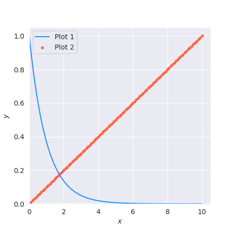
This is the half-decent output I was after! This has proven to be a very quick means of plotting data sets and I advise adding the path of the Plot program to your .bashrc file so it means you can call the program from any directory in the terminal!
There are improvements to be made which I will change at some point. For example:
- The use of indices to access the events from the GUI is messy but a unique
keysystem would need to be setup when storing the output in the dictionary, and if it aint broke… - More plotting options, custom line-styles, more colours etc… but these are trivial to add if you want to.
- Make the pandas dataframe smarter when looking for column separators.
- Add another option to specify \(x\) and \(y\) axis ranges.
- Add option for marker sizes and styles for when scatter plots are used; although I could keep going and produce a full blown GUI plotting package…